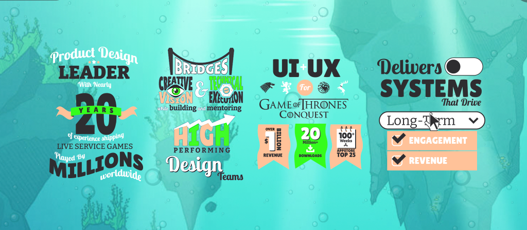
One of the great things about good UI design is that it can take otherwise boring content and breathe life and vibrancy into it, drawing the user in and making them want to sit up and pay attention. It's always been the goal of this site to surprise people with cool animations or unexpected interactions that make them want to explore more and see what's next. So when I launched my site, the first thing you saw on my About page was a professional summary in the form of a bulleted list of how awesome I am. Not exactly the most compelling experience.
I'd long wanted to improve that experience. What I was saying was fine, but how I was saying it wasn't up to my standards. So I took the opportunity to play with typography and flex my motion design muscles.
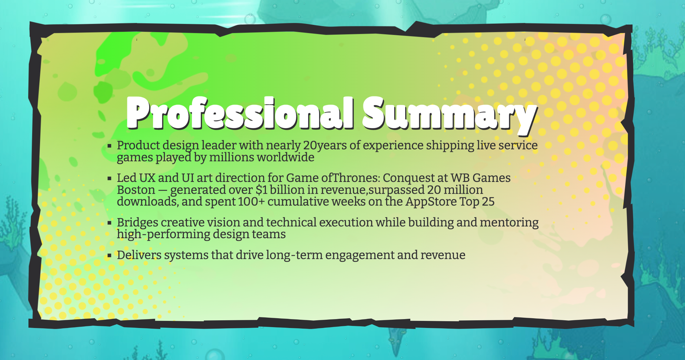
My original Professional Summary. Ugh... Gag me with a Powerpoint Slide.
I started by brainstorming in Adobe Illustrator how the text could lay out. It was a great exercise for examining every word and figuring out the story each one was telling. Each "bullet" got its own theme, and I leaned into that underlying story, highlighting the work I've done on the Game of Thrones titles, how I manage high-performing creatives and technical artists, and how interactivity is at the core of what I do.
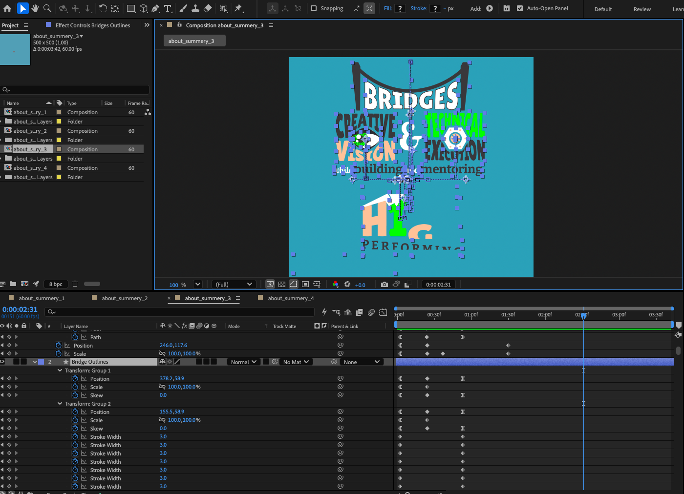
I made keyframes. So. Many. Keyframes.
Once I had the layout, I had a story to tell, and it was time to animate it. I considered using Webflow's native animation tools, but ultimately decided to build the animations in Adobe After Effects and export them as Lottie files using Bodymovin. That let me keep each animation contained in its own comp, which kept the project organized, and it let me animate shapes at the path level, which is where the cool warps and morphs come from as the content animates in.
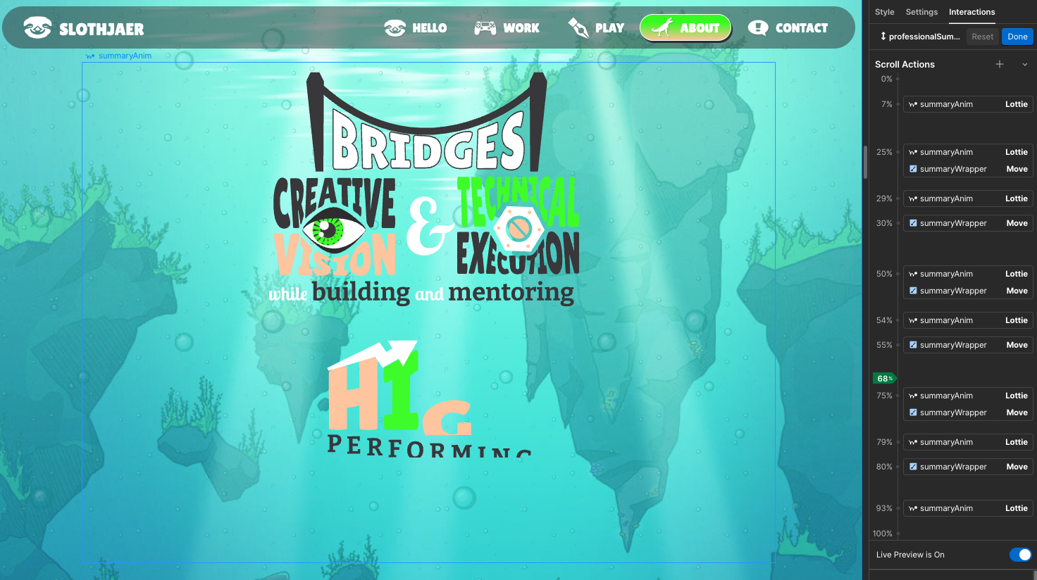
Tying it all together with Webflow.
I still needed Webflow's native animation tools to paginate the four animations and scrub the timeline of the Lottie files based on scroll position. Rather than build a separate animation controller for each section, I created a single controller at the parent level. I built a container div set to 600vh tall, which existed purely to give the user room to scroll. Inside that container, I laid out a flexbox grid holding the four animations, with each cell set to the width of the screen, so the four of them together added up to 4x the viewport width. The flexbox grid itself was set to position: sticky, so it would snap into place while the container div was in view and then scroll away naturally once the user passed it. From there, the controller just had to shift the flexbox grid's x-position at each quarter mark and scrub the focused Lottie animation from 0 to 100 as it came into focus.
The result is a professional summary that finally feels like me: four achievements that each get their own moment instead of disappearing into a wall of bullet points. It took a lot more effort than just typing out a list, but that's sort of the whole point. If a page about "look how good I am at my job" can't hold someone's attention, what's the point of being a designer? Go give the About page a scroll and let me know what you think.