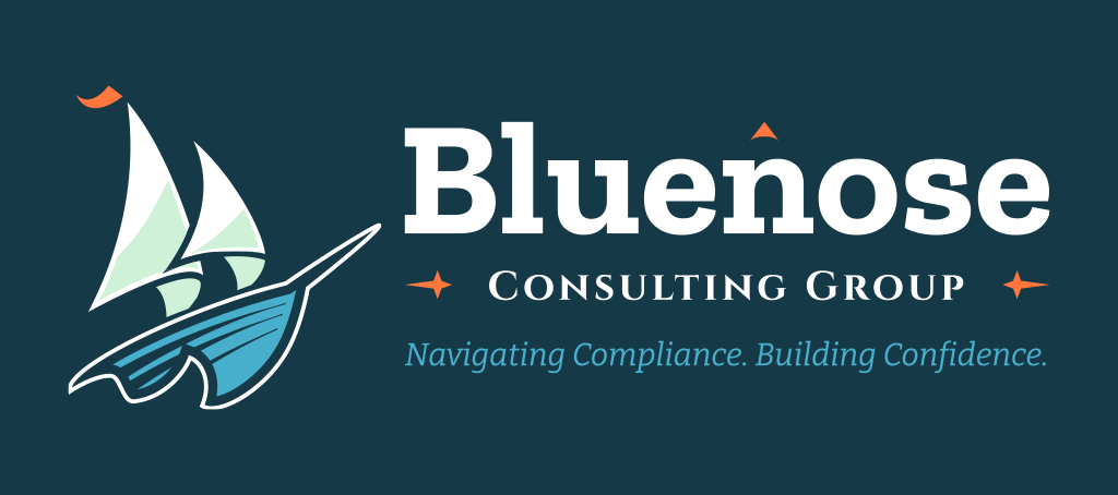
Bluenose Consulting Group is a new company dedicated to helping organizations work through complex compliance requirements. I had the opportunity to help them build a brand identity from scratch. Amanda Morash, Bluenose’s founder, named the company after the Bluenose schooner, whose Nova Scotia heritage has historical ties to her family. That history, along with the tagline, gave me a strong story to build on: “Navigating Compliance. Building Confidence.”
We started by choosing three brand attributes to guide every decision that followed:
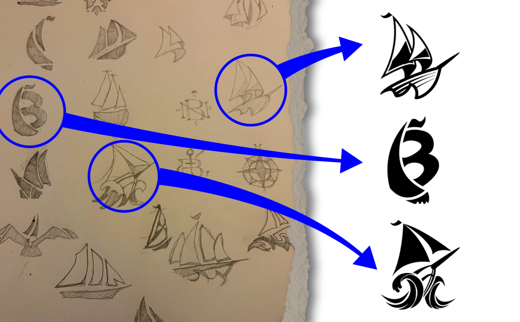
I sketched dozens of ideas in my notebook, then took the three strongest into Adobe Illustrator for refinement.
The final mark is a two-sail schooner leaning into the wind. Two sails working together express collaboration, and the forward motion of the hull suggests a firm that keeps its clients moving ahead.
The drawing has a hand-cut quality, with tapered strokes and a strong silhouette, so it feels crafted rather than generic. A small tangerine pennant at the top of the mast gives the mark a single warm accent that carries through the rest of the system.
The type leans into maritime heritage. Each typeface has a clear job:
Two small details tie the type back to the story. A tangerine chevron above the “n” points north like a compass needle, a nod to the schooner’s Nova Scotia heritage. Two tangerine compass stars bookend “Consulting Group,” connecting directly to “Navigating Compliance.”
All four typefaces are free from Google Fonts, so the client can use them anywhere without licensing costs.
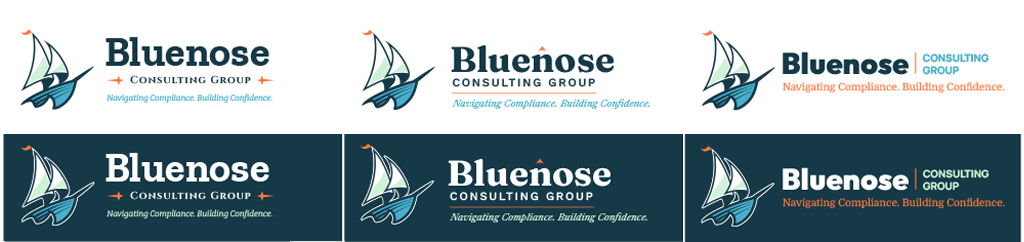
I provided three variations for the wordmark and we refined it to the one we liked best.
I used Coolors to brainstorm color combinations that work (it’s also where all the fancy color names came from). The palette pairs a deep, serious anchor with fresh sea tones and one warm accent.
A logo is only useful if it works everywhere the client needs it. The final suite covers every common use:
Each lockup comes in full color and one color, positive and reversed. The simplified icon was redrawn, not just scaled down, so the ship stays clear in a browser tab at 16 pixels.
The 13-page brand guidelines cover clear space, minimum sizes, color variations, misuse, color accessibility, and typography. The file kit is organized by what the client wants to do rather than by file type, with a simple guide that answers “Which file do I use?” so a non-designer can pick the right logo every time.
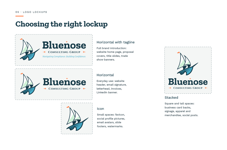
The final logo lockups, ready for whatever format is needed.
Bluenose now has a complete, consistent identity and the tools to use it without a designer on call. The brand tells a clear story: a steady hand guiding clients through difficult waters.