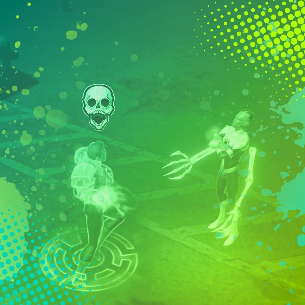

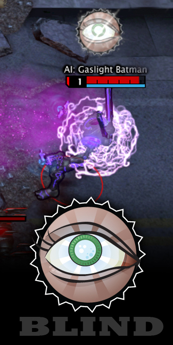
Early production on Infinite Crisis used ambient particle effects to communicate status effects applied to characters. While the approach was immersive and grounded in the game world, playtesting revealed that the subtlety of the effects worked against the fast, instinctive reads that a competitive action game demands. Player testing data made clear that in the heat of combat, players were missing critical status information entirely. The solution was a shift to icon-based UI indicators, which prioritized legibility and instant recognition over visual immersion. The change ensured that status information was always immediately visible regardless of camera angle, scene complexity, or combat intensity.
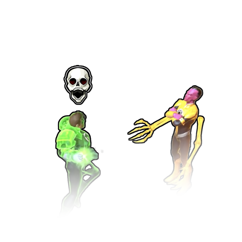
To ensure bold, instant readability at gameplay speed, I designed a set of status icons in Adobe Illustrator, prioritizing simple silhouettes and high-contrast shapes that would hold up clearly over any background or character skin. Once the visual language was established, I collaborated closely with the VFX team to animate and integrate the icons into Turbine's proprietary engine, ensuring the final implementation matched the design intent while fitting within the technical constraints of the system.
What I did


How I did it